1. The problem every sailor knows
Friday morning, you check the weather for Saturday. 15 knots NW, slight sea. Perfect. You confirm the outing.
Friday evening, you check again out of reflex. 22 knots. Hmm. You open a second app. It says 12 knots. A third. 18 knots. Which one to believe? Should you go?
The problem isn't the value displayed — it's that you don't know how long the models have been saying it. A 15-knot forecast stable for 5 days is nothing like a 15-knot forecast that has just replaced 22 knots, which had itself replaced 10 knots the day before.
This is exactly what Solano solves with its stability score.
Both situations display "15 knots" in any standard weather app. Solano shows you 9/10 for the first and 3/10 for the second.
2. A forecast as a movie, not a photo
The world's weather centres (Météo-France, ECMWF, NOAA…) recompute their models several times a day. Each recomputation is a run. For a given date — say Saturday noon — there are dozens of runs issued over several days, all of which forecast the conditions of that moment.
A conventional weather app only shows you a single image: the latest run. That's the "photo" — useful, but partial.
Solano reconstructs the full movie: every successive forecast for that same moment, over the last 5 days. If the images all look alike, the situation is stable. If they're all different, the situation is chaotic.
3. Reading the score on the map
Place a point anywhere on the map — a harbour, an anchorage, a spot. Solano automatically starts the stability analysis for the next available days.
The results panel shows:
- A day strip with each day's score
- For the selected day, the detailed scores per model
- The trend: score rising (the situation is clarifying) or falling (it is degrading)
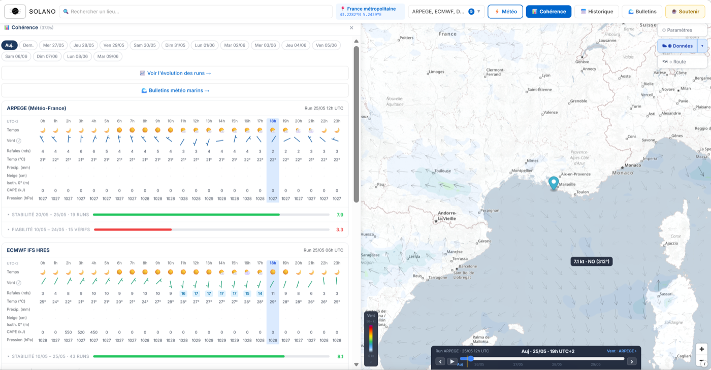
A score is computed separately for each model. If ARPEGE shows 8/10 and GFS 4/10 for the same day, the two models don't agree with each other — an extra cause for attention.
4. The spaghetti chart
Click a model in the results panel to open the Spaghetti panel. That's where you see the movie in detail.
Each coloured line is a different run, from the oldest (pale shade) to the most recent (saturated shade). The displayed variable — mean wind, gusts, direction… — is chosen from the tabs at the top of the chart.
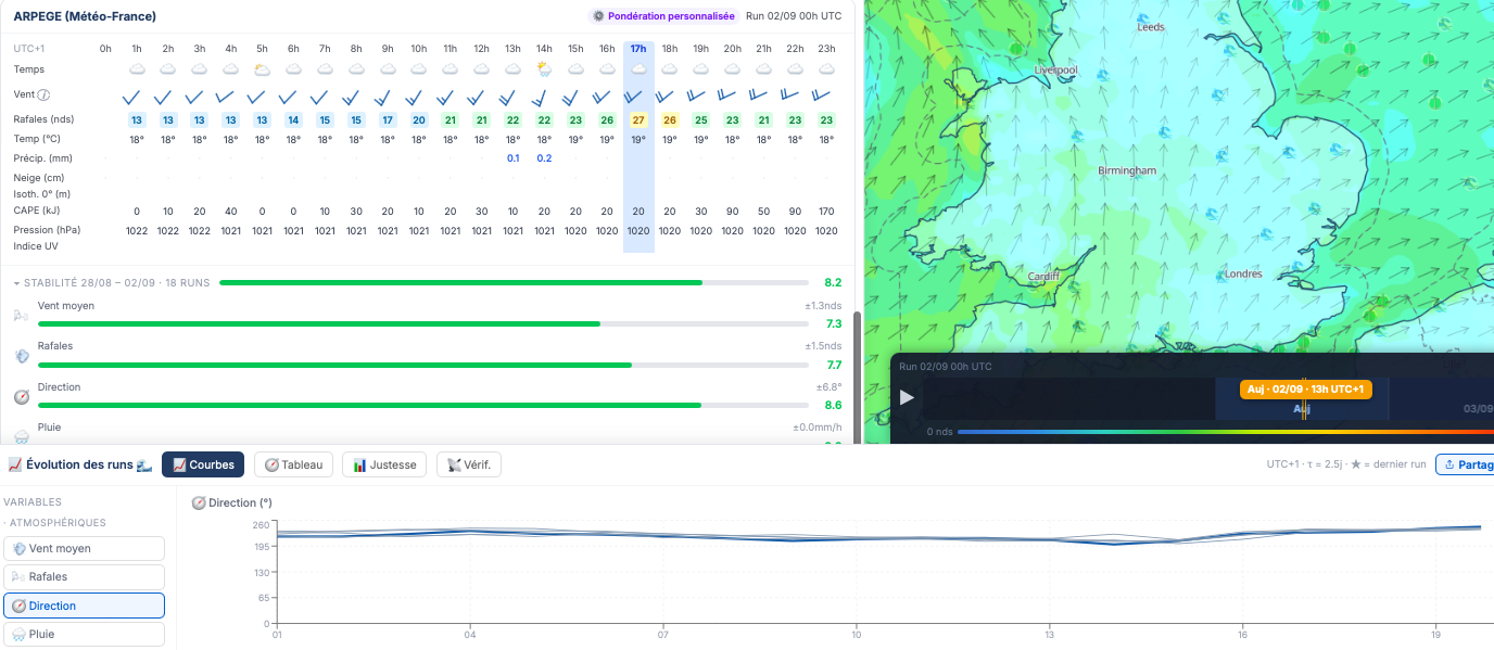
A few common patterns to recognise:
- All curves grouped — strong consensus. The score is high, and so is confidence.
- Scattered curves that tighten towards the right — the situation is settling as the target day approaches. Recent runs converge, a good sign.
- Curves that spread towards the right — the situation gets harder as it draws closer. A worrying sign: the models are losing confidence in themselves.
- A single very offset run — often a run that failed technically (faulty initialisation), not a genuinely divergent forecast. Worth noting but not over-interpreting.
The ERA5 Verif. tab
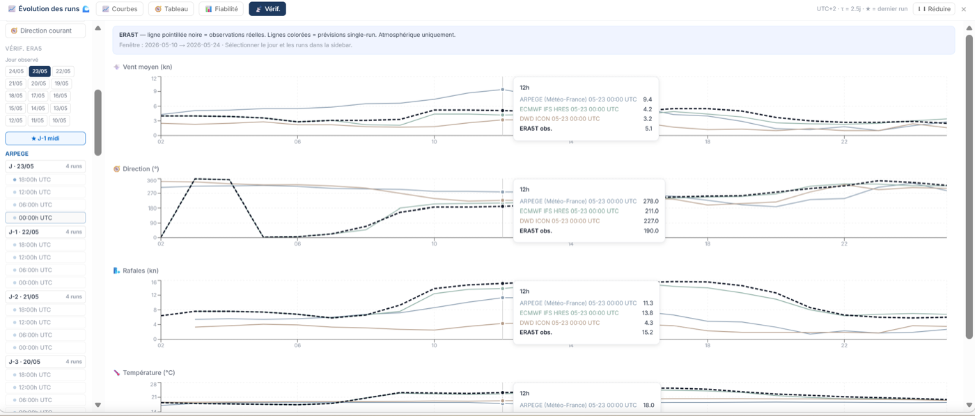
The 4th tab, 📡 Verif., adds a reference line: the ECMWF ERA5T reanalysis, available for the last 15 days. ERA5T is not a direct field measurement, but a coherent hour-by-hour reconstruction of the atmosphere, obtained by assimilating sparse data (stations, radiosondes, satellites, buoys). You can directly compare what the models had forecast and what the reanalysis indicates — a concrete way to assess a model's past accuracy on your point.
5. Quick reading grid
As a guide, here is how to interpret the scores in a sailing or marine-activity context:
A high stability score does not mean the weather will be good — it means the models are consistent in their forecast, whatever it is. A 9/10 score can correspond to a well-established, predictable storm. Always cross the score with the actual forecast values.
6. Adapting the score to your activity
By default, the stability score gives more weight to gusts (30 %) and mean wind (20 %), because those are the most safety-critical variables at sea. But if you hike, paraglide, or manage an outdoor event, your priorities may be different.
In the app's preferences (account required), you can adjust the weight of each variable: wind, gusts, direction, precipitation, visibility, temperature, cloud cover. The score recomputes immediately with your custom weighting.
A few customisation examples:
- Offshore sailing — priority on gusts and direction (heading and point of sail)
- Coastal sailing, optimistic — mean wind and direction, precipitation secondary
- Mountain hiking — precipitation and visibility first, moderate wind
- Outdoor event — precipitation maximum, wind and gusts
7. The accuracy score — ERA5 MAE
Stability measures the internal consistency of forecasts. It says whether the models agree with each other — not whether they are right. Two models can perfectly agree on 25 knots and both be wrong.
The accuracy score answers a different question: has this model, on this exact point, been precise in the past? It is computed automatically by comparing historical forecasts to the reference reanalysis ERA5T.
The measure used is the MAE (Mean Absolute Error):
This calculation is carried out separately for each model, each variable (wind, gusts, direction, precipitation, temperature, cloud, pressure) and each lead time from J+1 to J+7. The result: a local accuracy profile, specific to your geographic point.
Interpretation reference points for the key variables:
8. Accuracy badges and chart
Accuracy is displayed in two places in the app.
Coloured badges on the model cards
In the results panel, each model shows green / orange / red badges for the key variables. These badges summarise the mean MAE over the last 15 available days, all lead times combined. An all-green model on your point is a historically accurate model for that area — one to favour.
Degradation-by-lead-time chart
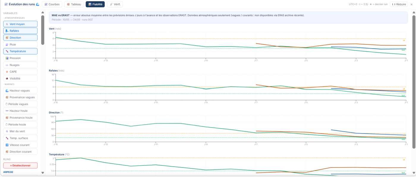
In the Spaghetti panel, a time chart shows the MAE curve from J+1 to J+7 (or J+15 depending on available data). This curve shows how the model's accuracy degrades with lead time — which is universal — but also how fast it degrades, which is specific to each model.
A model with a flat curve up to J+4 that then rises sharply is reliable in the short term but drops off fast. A model with a gradually rising curve is more regular in its degradation, and therefore more predictable to use.
9. Ensemble confidence — do the scenarios agree?
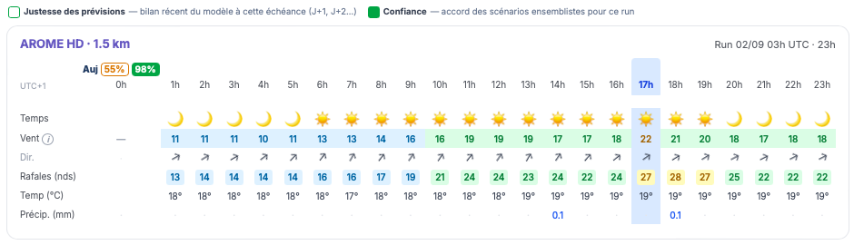
Stability looks at a model's recent past (its successive runs), the MAE accuracy looks at its measured errors. Ensemble confidence adds a forward-facing reading: for this precise day, do the possible scenarios agree?
Each major weather centre doesn't publish just a single forecast: it also runs its model dozens of times with tiny variations to the starting point — the ensemble forecast. When all these scenarios tell the same story, the situation is predictable. When they scatter, the atmosphere is "at a tipping point" and no forecast deserves blind trust.
Solano gathers a pool of about 120 scenarios from three ensemble systems — GEFS (US), ICON-EPS (German) and ECMWF-ENS (European) — and, for each model shown, computes the share of these scenarios that give a practically equivalent wind (within ±30 % / ±4 kt). This percentage is shown as a coloured pill, day by day, next to each day in each model's strip in Quick weather: green ≥ 70 %, orange ≥ 50 %, red below.
Concretely: a confidence of 80 % on a given day means "the vast majority of scenarios confirm this wind"; 40 % means "the scenarios diverge markedly, take this forecast with caution". It naturally drops the further out you look (the scenarios separate with lead time), and lets you spot at a glance which model is best supported, and which days are worth watching.