1. Why overlay all the runs?
A weather model is relaunched several times a day. Each launch — called a run — produces a new forecast for the following days. For a given target date, there are therefore dozens of runs issued over several days, all of which forecast the conditions of that moment from different distances in time.
Most apps only show the latest run. That's the "photo" — useful, but it says nothing about how the forecasts have evolved over time.
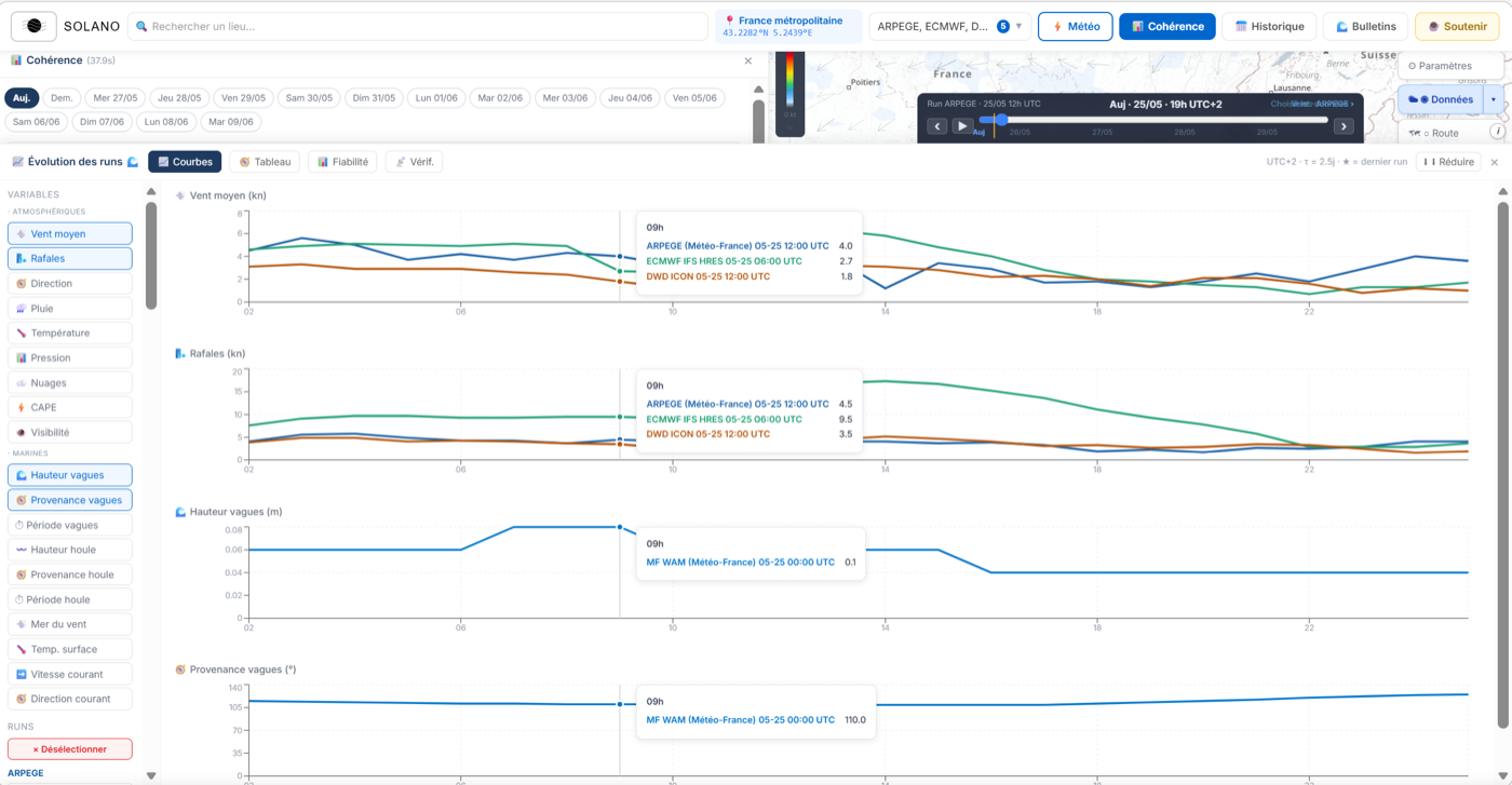
Solano's spaghetti chart overlays all these runs on a single chart. The image that forms — tight or scattered, converging or chaotic — gives information that the value alone cannot: was the situation predictable?
2. How to open the Spaghetti panel
Place a point on the map and wait for the analysis to load. In the results panel, each model is shown with its stability score. Click a model to open the corresponding Spaghetti panel.
The Spaghetti panel opens on the right (on desktop) or at the bottom (on mobile). By default it shows the Mean wind variable for the day selected in the strip.
3. Reading the chart: axes, colours, tabs
The axes
Horizontal axis — the hours of the selected day, from 0h to 23h.
Vertical axis — the value of the displayed variable (knots for wind, mm/h for rain, degrees for direction…).
The curve colours
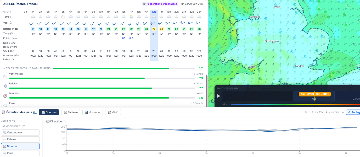
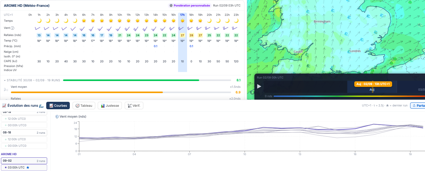
Each curve is a different run. The colour indicates its relative age: recent runs are drawn in a saturated shade, older runs in a pale shade. The most recent run is always the most prominent curve — it's the "current forecast".
The variable tabs
At the top of the chart, a set of tabs lets you change the displayed variable:
- Wind — mean wind speed in knots
- Gusts — maximum speed in knots (often more unstable than the mean wind)
- Direction — wind heading in degrees (note: 355° and 5° are almost identical)
- Rain — precipitation in mm/h
- Temperature — in °C
- Cloud — cloud cover in %
- Pressure — sea-level pressure in hPa
4. The patterns to recognise
A few configurations come up regularly. Learn to identify them and you'll read a spaghetti in a few seconds.
5. The ERA5 Verif. tab — forecast vs. reality
The 4th tab of the Spaghetti panel — 📡 Verif. — adds another dimension: the comparison with what actually happened.
ERA5T: the reference reanalysis
ERA5T is ECMWF's near-real-time atmospheric reanalysis. It's not a direct field measurement: it's a coherent hour-by-hour reconstruction of the state of the atmosphere, obtained by data assimilation of sparse observations (weather stations, radiosondes, satellites, buoys) into a state-of-the-art numerical model. It is available with roughly a 1-to-2-day delay and represents the best available estimate of what happened.
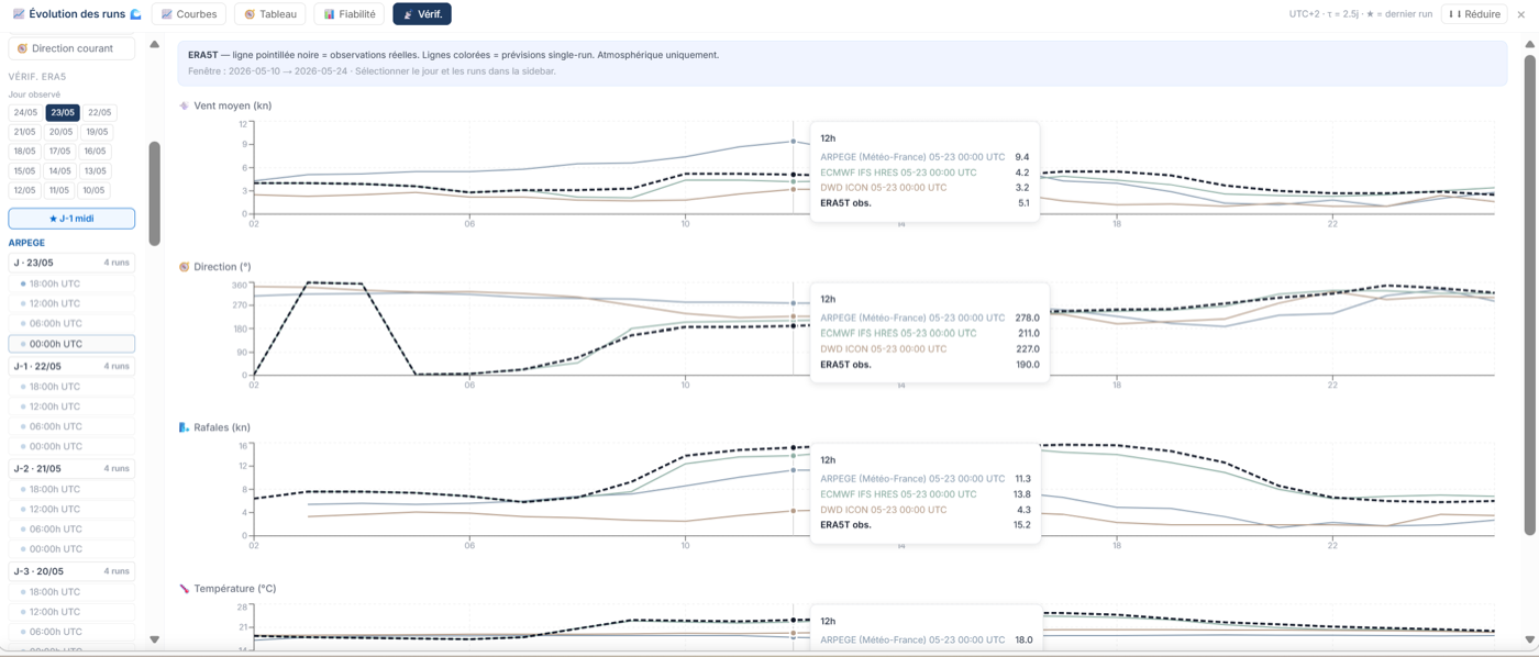
In the Verif. tab, the ERA5T line is drawn as a black dashed line. The coloured curves are the selected model's runs for that same day. The question becomes simple: were the models right?
How to navigate past days
A dedicated day selector appears in the Spaghetti panel in Verif. mode — independent of the main strip. You can therefore compare past forecasts without changing the selected day in the rest of the app.
The last 15 days are available. The run labels show "J-N · DD/MM" to place each curve relative to the observed day.
What Verif. does not cover
Recent ERA5T doesn't provide every variable. Wind direction, visibility and marine data (waves, currents) are not available in this tab. The variables covered are: mean wind, gusts, precipitation, temperature, cloud cover and pressure.
6. Usage tips
- Compare several models. If ECMWF shows tight curves but ARPEGE scattered ones, the two models don't agree — a sign of uncertainty that the multi-model score will also capture.
- Look at gusts first. Gusts are the most volatile variable between runs. A scattered "gusts" spaghetti while the mean wind is stable indicates peak uncertainty that conventional weather hides.
- Use ERA5 Verif. to calibrate your confidence. If a model is systematically right at J-2 on your spot, you can give it more credit. If its J-4 runs are always far from ERA5, they deserve less attention.
- Low-score days are worth watching. If a day's score is low at J-3, come back at J-2: it frequently happens that the score rises as the models converge on the approach.