Reading the weather on the map: every available layer
Wind, gusts, temperature, cloud, rain, snow, freezing level, waves, currents, isobars — the Solano map brings all this data together in a single animated interface.
Published 18 May 2026 · 7 min read
1. The available weather layers
The map shows animated weather layers overlaid on the base map. Each layer corresponds to one variable and uses its own reference models. You select them by group from the strip.
💨
Wind
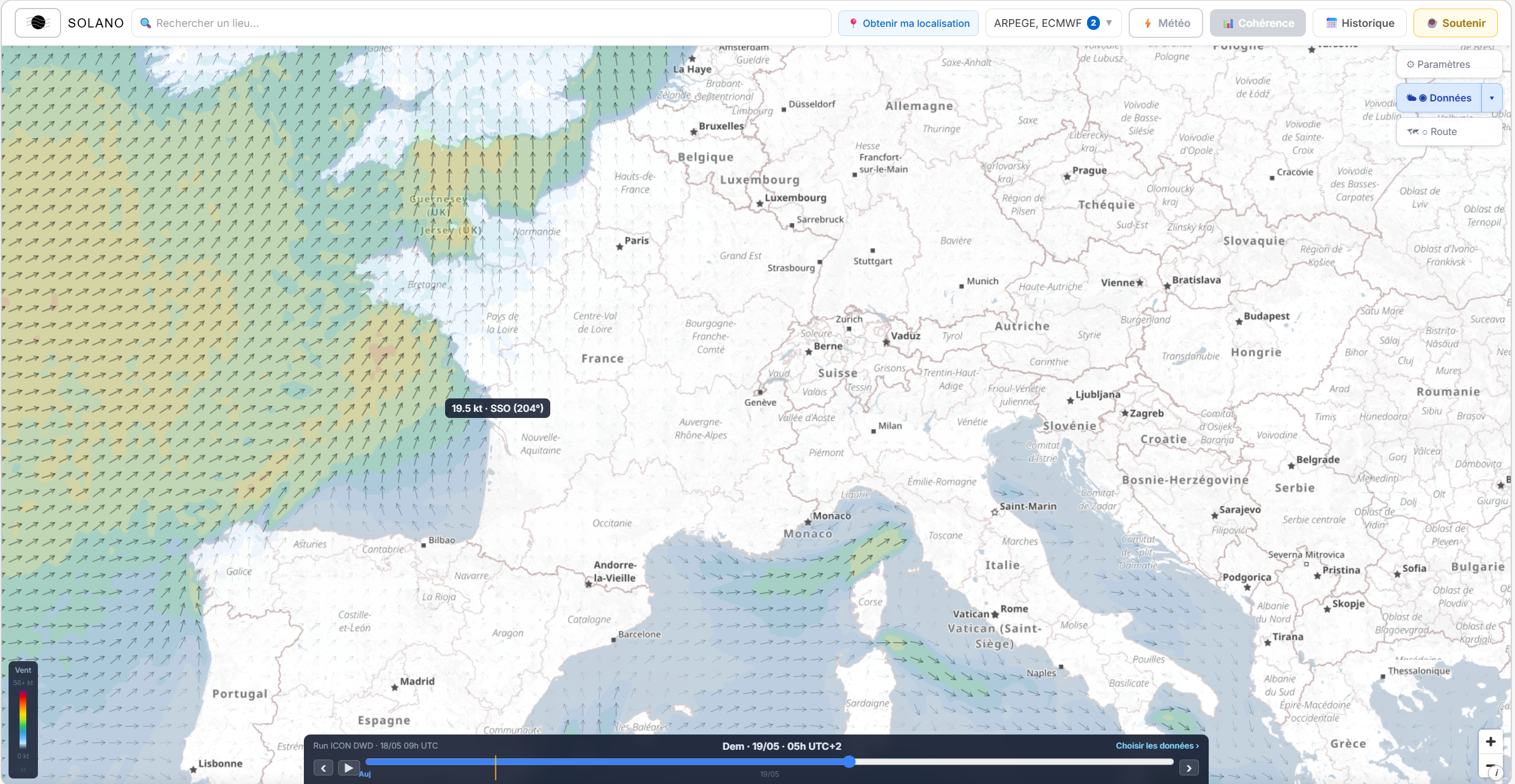
Animated arrows coloured by speed (transparent in calm, blue→green→yellow→orange→red→purple in a storm). The arrows point in the direction the wind is blowing towards. Models: ARPEGE, AROME HD, ECMWF IFS, ICON DWD, ICON-2I, MET OFFICE.
💥
Gusts
Same palette as wind, with thresholds shifted by about +20 % — a 27 m/s gust shows as orange-red where a 17 m/s mean wind would already be orange. Useful for anticipating peaks, especially for sailing and activities sensitive to squalls. Models: ARPEGE, AROME HD, ECMWF IFS, ICON DWD, GFS, ICON-2I, MET OFFICE.
🌊
Waves
Significant wave height (H1/3) in colour, with propagation-direction arrows. The layer only appears over marine areas. Models: WAM (ECMWF), GWAM (DWD), GFS Wave (NCEP), EWAM. In Quick weather and Trip Weather you can also turn on Hmax — the estimated maximum height (≈ 1.86 × H1/3, or calibrated on nearby buoys), useful for anticipating the strongest waves beyond the average.
🌀
Currents
Speed and direction of surface currents at sea, animated. A dedicated palette (cyan→green→orange→red) calibrated for 0–4 knots. Useful for light-wind sailing, sea kayaking, diving. Model: Météo-France Currents.
🌡️
Temperature
Air temperature at 2 metres, in a colour gradient. Lets you visualise thermal gradients over a wide area — useful for anticipating thermal breezes, heat storms or cold-air intrusions. Models: ARPEGE, ECMWF IFS, GFS NOAA.
☁️
Cloud
Total cloud cover as a percentage. Quickly see the overcast areas and clear-sky windows without opening the hourly table. Models: ARPEGE, ECMWF IFS.
🌧️
Precipitation
Rainfall totals in millimetres. Locate rain cells and their movement over time. Particularly useful for land activities or for anticipating showers on a body of water. Models: ARPEGE, ECMWF IFS.
❄️
Snow
Snowfall water equivalent (mm). A progressive blue palette, from very pale blue (traces) to deep midnight blue (heavy falls). Models: ARPEGE, ECMWF IFS, ICON DWD.
🏔️
Freezing level (0° isotherm)
The altitude in metres at which the temperature reaches 0 °C. In the mountains: the rain/snow line. At sea: an indicator of deep atmospheric instability — a low freezing level in summer signals a cold air mass aloft, favourable to violent squalls. Palette from dark blue (freezing at sea level) to red (freezing very high). Models: ICON DWD, GFS NOAA.
🔵
Isobars
Lines of atmospheric pressure at sea level, as an overlay on the other layers. They let you visualise the synoptic structure: anticyclones (high pressure), lows (low pressure), fronts. The tighter the lines, the stronger the pressure gradient — and the potentially stronger the wind. Toggled from the Data › Overlays selector.
📡
Real-time observations
An overlay of actually observed measurements — moored buoys, airport stations (METAR), observing ships — that can be superimposed on the forecasts. Each marker shows, on hover, wind, gusts, pressure, temperature and, for buoys, wave height. Unlike models, these are measurements of the present: a ground-truth point to recalibrate your interpretation. Toggled from Data › Overlays.
The map with the wind layer on — the coloured arrows show wind direction and intensity.
2. Turning on a layer and choosing a model
Weather layers are turned on from the strip at the bottom of the map — the horizontal band with the time at its centre. To the right of the strip, a clickable area shows the active data group and the selected model.
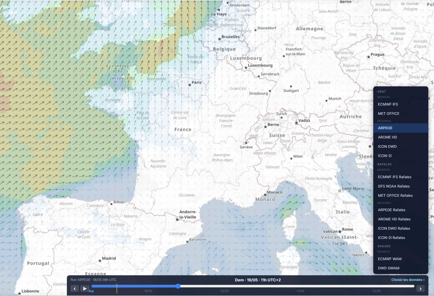
Clicking this area opens the data selector: you choose the group (Wind, Gusts, Waves, Currents, Temperature, Cloud, Precipitation, Snow, Freezing level) then the model available for your geographic area. The model and layer apply to the map immediately.
The data selector open (click the right-hand area of the strip), showing the 9 available groups and the associated models.
Tip: the right-hand area of the strip alternates every 4 seconds between the active group/model and the text "Choose data ›" — that's the signal that this area is interactive. It freezes as soon as you click it.
3. Navigating through time with the strip
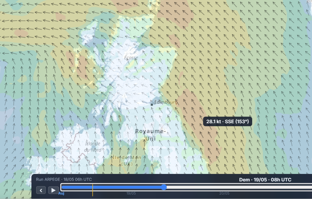
The strip is the central control of the map. It shows the current time at its centre and lets you navigate through time by dragging or clicking on past and future hours.
A close-up of the strip with the central time visible, and the wind layer displayed on the map for that time.
Drag left — go back in time (past forecasts or earlier hours)
Drag right — go forward into the future, up to the horizon of the active model
Click on an hour — jump directly to that hour
The animated weather layer and the hourly table (see section 5) update in real time while scrolling. The map reflects exactly what the model predicts for the displayed hour.
Navigating through time doesn't change the selected point or the analysis panels — only the map visualisation and the hourly data. You can therefore "travel into the future" on the map while keeping the results panel open.
4. Reading the legend
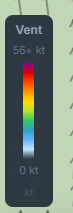
The legend appears vertically on the left edge of the map whenever a weather layer is active. It shows:
The displayed variable (e.g. "Wind", "Gusts", "Waves", "Freezing level"…)
The colour scale, from minimum (bottom) to maximum (top)
The threshold values at the colour transition points
The colour palettes are identical between the map and the app's hourly tables — a yellow value on the map corresponds to the same intensity as a yellow cell in the detailed table.
The vertical legend visible on the left of the map, wind layer active — a blue → green → yellow → orange → red progression.
5. The detailed hourly table
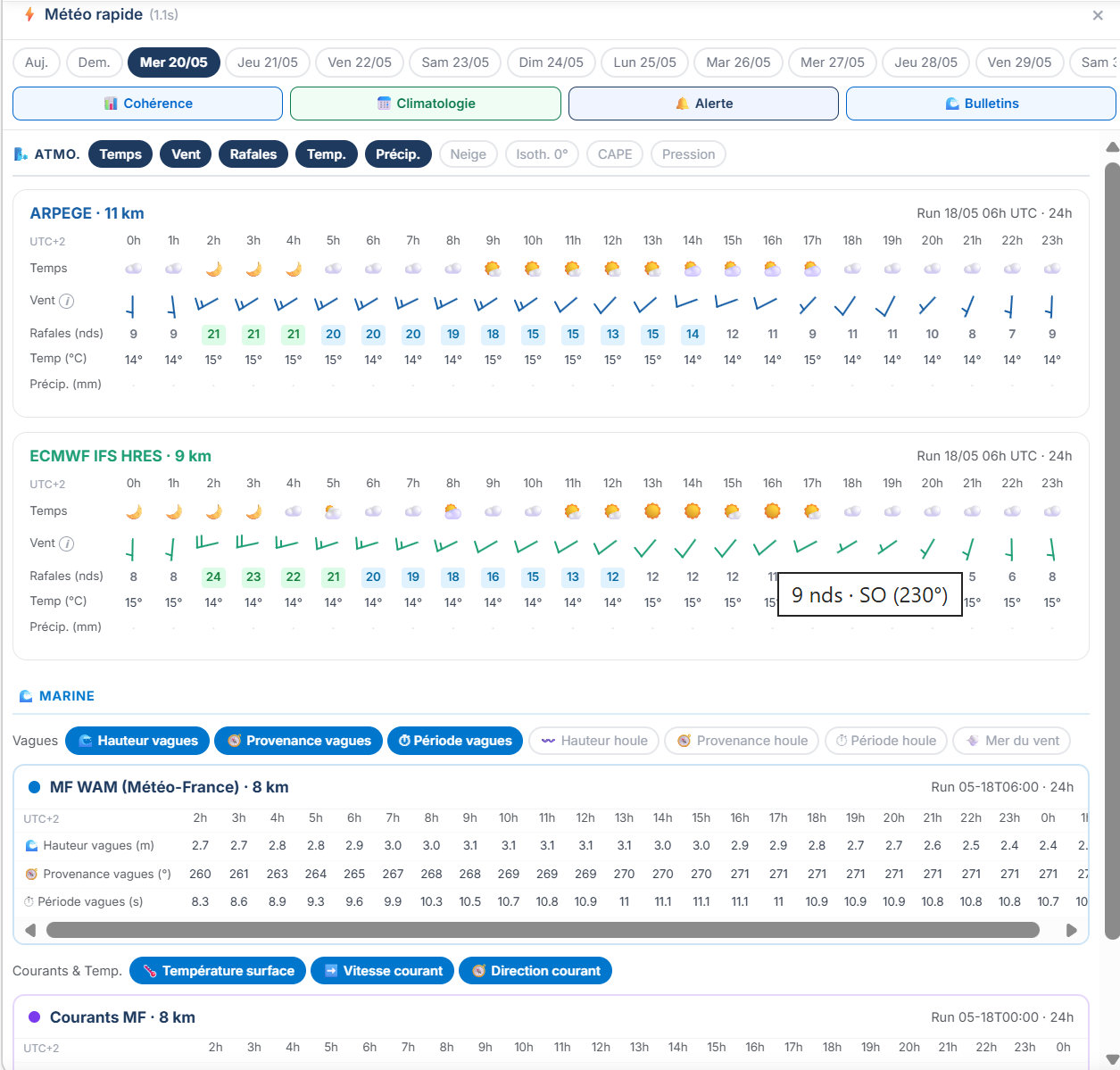
Alongside the map, the hourly table (accessible from the results panel, "Table" tab) shows, hour by hour, every weather variable for the selected point: wind, gusts, direction, precipitation, temperature, pressure, cloud cover, visibility — and marine data if the point is at sea.
The same colour palette as the map is used in the table — a green cell corresponds to a wind in the comfort zone, an orange cell to a situation worth watching. The table and the map are synchronised: clicking an hour in the table updates the map strip, and vice versa.
The hourly table open for a selected point, with the direction column and background colours visible on wind and gusts.
6. Satellite imagery
In the Data selector (the ▾ menu next to the button that lists wind, gusts, etc.), right at the bottom, the 🛰 Satellite group switches the map into observation mode: instead of model forecasts, it shows EUMETSAT imagery (Meteosat) in near real time. It's the natural complement to the weather layers — seeing what the sky is doing, not what a model predicts. The same strip as the weather layers, replayable over 2, 4, 6, 12 or 24 hours, animates the real evolution of cloud systems.
🛰️
Infrared
Cloud-top temperature, coloured to bring out convection: the colder a top, the higher and more active the cloud. Available day and night — the reference layer for spotting thunderstorms and squalls. Source: Meteosat Third Generation (MTG).
🌍
GeoColor
A natural rendering of the Earth by day, city lights and infrared by night — the image "as seen from space". Source: MTG.
💧
Water vapour
Humidity of the upper troposphere: reveals jet streams, dry intrusions and air-mass dynamics, invisible to the naked eye. Source: Meteosat Second Generation (MSG).
🌩️
Convection (RGB)
A colour composite that brings out developing cells, even before they produce lightning. Read it alongside the "Thunderstorm" index in Quick weather: the index describes a favourable environment, this layer shows what is actually breaking out. Source: MSG.
🌧️
Precipitation
An estimate of the rain in progress, combining infrared from geostationary satellites with microwave measurements from polar-orbiting satellites. It's an observation, not a forecast — the satellite equivalent of radar, with the advantage of covering the open sea where no ground radar reaches. Source: MSG.
☁️
Cloud-top height
The height of cloud tops. A very high top signals a powerful updraft: it's the marker of convective clouds. A product originally aimed at aviation. Source: MSG.
⚡
Lightning
Accumulated flash areas, detected by the satellite's lightning imager — live thunderstorm activity. Unlike the previous base layers, lightning overlays the chosen image. Source: MTG.
🎯
Thunderstorm cells (RDT)
Automatic detection and tracking of developing storms — each cell is outlined, and the number gives its top temperature (the colder it is, the more vigorous the cell). RDT spots a cell before it electrifies, and covers the sea. Like lightning, it overlays the chosen base. Source: MSG.
The six base layers (infrared, GeoColor, water vapour, convection, precipitation, cloud-top height) are shown one at a time; lightning and thunderstorm cells are ticked on top and overlay the active base. All satellite data is provided by EUMETSAT.